What’s in the template
A tour of how the template is put together, so you know where every piece of content lives before you start.
Morrow is a five-page product site for a modern software or AI company: Home, Platform, Solutions, Pricing and Contact, plus a custom 404 page and this guide. Everything is built so you can rebrand it in an afternoon and keep editing it for years, either by hand in Framer or by asking an AI agent to do the work for you.
The Home hero: the laptop film, headline and buttons. The film’s screen image is one property.
Layout template
The navigation, the closing call-to-action with its animated gradient, and the footer live in one shared template. Edit them once and every page updates.
Canvas components
Ten reusable components (cards, list items, FAQ items and buttons). Each has its own properties in the right-hand panel, so you change content without touching the layout.
Product visuals
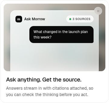
Code components draw the product UI and the interactive sections you see across the site: the laptop film, dashboards, the phone view, feature and bento animations, the activity feed, the review card, the globe, the steps accordion, customer stories, the day timeline and the logo strip. They are fully animated and editable through their properties.
CMS
The Workflows collection powers the use-case cards on the Solutions page. Add, reorder or remove items in the CMS and the grid updates itself.
Styles
Twenty-one text styles and a small set of colour styles control all typography and colour. Change a style and every text layer that uses it follows.
Before you change anything, duplicate the project or work on a branch. Every change an AI agent makes also lands on a branch automatically, so you can compare and undo.
Editing pages and components
Every repeated element is a component with simple fields. Here is each one and what you can change.
Most content is either plain text on the canvas or a property on a component. Select a component instance on a page and edit its fields in the right-hand panel. Double-click the component to edit its design for every instance at once.
Buttons / Pill
Label, link and icon. Variants: Dark, Light and Small, each with its own hover state.
Cards / Feature
Title, description and link. The variant (Search, Build, Approve, Metrics, Sync, Privacy) chooses the animated visual.
Cards / Bento
Title and description. The variant (Chat, Voice, Calendar, History, Presence, Automations, Activity) chooses the visual; History and Presence are dark.
Cards / Testimonial
Quote, photo, name and role. Photos are small, compressed portraits so the ticker stays light.
Cards / Use Case
Team, title, description, outcome and link. On the Solutions page these fields come straight from the Workflows CMS collection.
Lists / Icon Feature
Icon, title and description. Used for the icon lists on Home, Platform and Contact.
Lists / Stat
Icon, value and label for the results row on Solutions. The value counts up from zero once when the row scrolls into view, then keeps exactly what you typed, including symbols such as % or ×.
Lists / Check Item
Text, with an Inverse variant for dark cards. Used in the pricing plans.
Lists / FAQ Item
Question and answer. Variants: Stacked, Split, and Split Phone for small screens.
Lists / Contact Channel
Icon, title, description, link text and link.
Solutions page: each card is one item in the Workflows collection.
Open the CMS and choose Workflows. Each item is one use-case card on the Solutions page, with Title, Team, Description and Outcome fields.
Drag items to reorder them, duplicate an item to add a new card, or set an item to draft to hide it without deleting it.
To show the collection somewhere else, add a Collection List to any page, pick Workflows, and drop a Cards / Use Case instance inside it. Connect each property to a CMS field.
The navigation, the closing “Your next chapter” section and the footer live in the Main layout template. Open it from the Pages panel to edit them for every page at once.
The closing section’s background is a Liquid Gradient shader. Select it to change the colours, speed and scale in the properties panel.
Product visuals and their properties
The animated product UI is drawn in code but edited like any other layer, through its properties.
The product UI on the site is drawn in code, so it stays crisp, animates smoothly and never needs screenshots. Every visual has properties you can change without opening the code. Select the component on the canvas to see them.
Laptop film (Home hero)
Screen image shows on the laptop screen for the whole film; use a 16:10 image such as 2000 × 1250. Also: image fit, background colour (match it to the hero so the edges blend), move duration of the settle animation, and the replay control.
Demo dashboard (Home and Platform)
Workspace group: brand, label, user, role, avatar, headline and badge. Phone switches on the animated phone view. Background sets the blurred image behind the glass frame.
Journey (Home)
Steps: up to four tabs with a tab name, title and copy. Background and the Workspace group, as above. The dashboard pans to a different area for each step.
Feature visuals
Mode picks the animation (search, build, approve, metrics, sync, privacy). Accent and background are editable. On the page, change the Feature card variant instead.
Bento visuals
Mode picks the animation (chat, voice, calendar, history, presence, automations, activity), plus a background image.
Sections: Live activity
Stats (value and label), the feed (agent, action and place for each row), panel title, user name and avatar.
Sections: Review card
Title, branch, reviewer name and avatar, and the note Morrow leaves on the change.
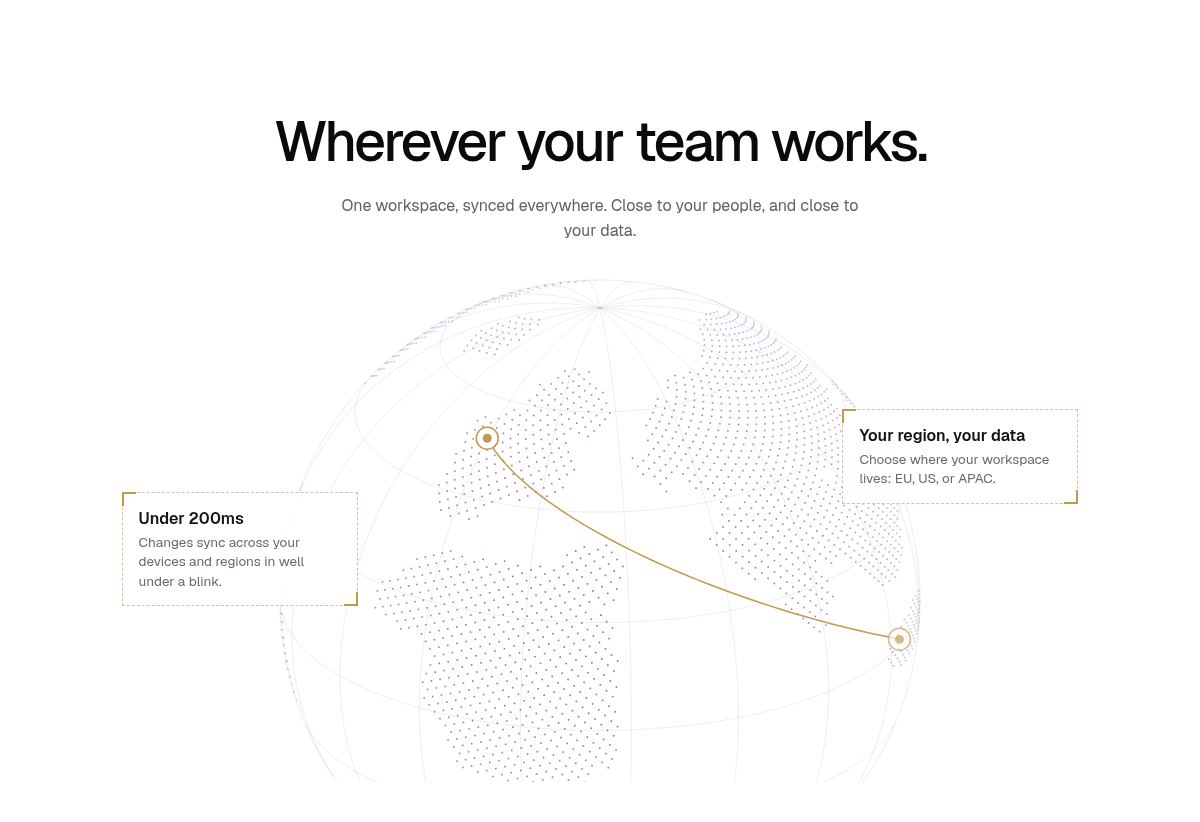
Sections: Globe
Left and right callout titles and text, plus land and arc colours.
Sections: Steps accordion
Steps with a title, copy and the visual shown for each, plus the note under the list.
Logo strip (Home)
The Logo Cycle component. Logos: leave empty to use the 18 built-in integrations, or add your own with a name and an image (a name such as Slack or Figma reuses the built-in mark). Also: cells, the time between changes, the stagger between cells, names on or off, colour, icon size, cell height, dividers, line colour and corner radius.
Sections: Customer stories
Story set switches between the two built-in sets. Stories holds your own: company, result line, quote, name, role and an optional background image for each. The card moves to the next story every 7 seconds and has arrows and dots.
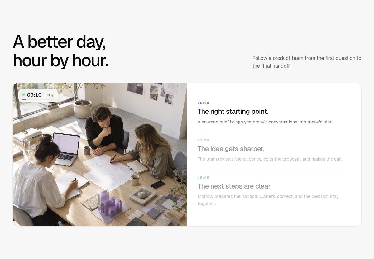
Sections: Day timeline
Steps: up to five, each with a time, title, copy, image and time colour. The image changes with the active step, and the clock on the image rolls to that step’s time and keeps ticking.
Panels (Home FAQ and more)
Mode picks the panel. In FAQ mode, FAQ items holds your questions and answers.
Leave a text field empty to keep the template’s default copy. That lets you change one line without retyping the rest.
Connect an AI agent to Framer
Connect an AI agent to this project so you can make changes by describing them.
Framer has an official connection for external AI agents. It works with Claude Code, Cursor, Codex, Gemini CLI, Windsurf and any local agent that supports skills and can run terminal commands. You don’t need to set up a separate MCP server: the Framer agent gives your AI direct access to the canvas, components, styles and CMS of the projects you connect.
Your own copy of this template in your Framer workspace.
Node.js 18 or newer installed on your computer (check with node -v).
An AI agent, for example Claude Code in a terminal, the Claude desktop app’s Code tab, or Cursor.
Open a terminal and run the setup command below. It installs the Framer skill into your AI tools.
Start your agent in any folder. In Claude Code, run the /framer skill; in other tools, ask the agent to connect to your Framer project.
Paste your project link. Copy it from your browser’s address bar while the project is open in Framer.
The first time, a browser window opens so you can approve access. After that the agent reconnects automatically.
Ask for a change. The agent works on a branch in your project, so you can review the result in Framer before you merge and publish.
npx @framer/agent@latest setup
Connect to my Framer project https://framer.com/projects/your-project-link
Start every session with: “Read the Guide page of this project first, then …”. The agent will learn the components, properties and conventions described here.
Name what you want to change: the page, the section heading and the component (for example “the Cards / Bento component on Platform”).
Ask the agent to screenshot the result on desktop, tablet and phone and to fix anything that overflows.
Keep each request focused. Several small prompts give better results than one enormous one.
Ask it to reuse existing text styles, colour styles and components rather than creating new ones.
Agents edit the canvas, not your live site. Nothing is visible to visitors until you publish.
External agents can’t change some project settings, such as the project name and custom domains.
You can revoke an agent’s access at any time from your Framer account.
Prefer a plugin? Community MCP plugins for Framer also exist, but Framer recommends the official agent connection above.
Bring in designs with the Figma MCP
Let your agent read Figma frames and rebuild them here with the template’s styles and components.
Pair the Framer agent with Figma’s MCP server and your agent can read a Figma frame (layout, text, colours, variables and images) and rebuild it in this template with the existing styles and components. It is the fastest way to swap in your own product screens, sections or brand system.
In Claude Code, run the command below to add Figma’s hosted MCP server. It works on every Figma plan and seat.
Run /mcp, choose figma and sign in with your Figma account in the browser.
In Cursor or VS Code, add an MCP server with the URL https://mcp.figma.com/mcp in the MCP settings and sign in.
In Figma, right-click the frame you want and choose Copy link to selection. Paste that link into your prompt.
claude mcp add --transport http figma https://mcp.figma.com/mcp
Design your frame at the same widths as the site (1200 desktop, 810 tablet, 390 phone) and name your layers. The agent maps named layers to the right components more reliably.
Prompt library
Ready-made prompts written for this exact project. Copy, fill in the brackets, paste.
Copy a prompt, replace anything in square brackets, and paste it into your connected agent. The prompts are written for this template: they name the real components, properties and sections so the agent knows exactly what to change.
Connect your agent to this project (see Connect an AI agent above).
Find the area you want to change below and copy its prompt.
Replace everything in [square brackets] with your own details.
Paste it into your agent, then review the branch it creates in Framer before merging.
Read the Guide page of this Framer project first. Then rebrand the site from Morrow to [Your Company]: replace the wordmark in the Main layout template’s navigation and footer, update every page title and meta description, and change the Workspace property group (brand, user, role, avatar, badge) on every demo dashboard and journey component. Keep the existing text styles and layout. Screenshot Home and Pricing on desktop and phone when you are done.
Update the colour styles to my brand: primary [#hex] for Ink, accents [#hex] for Violet, [#hex] for Blue and [#hex] for Green. Then find hard-coded colours inside the code components (the globe land and arc colours, the review card background panel, the chart gradients in the dashboards) and change them to match the new accents. Check contrast stays readable and show me before and after screenshots.
Switch every text style from Geist to [Font name]. Keep the current sizes, but adjust letter spacing and line height so large headings stay tight and body copy stays comfortable. Also update the fonts used inside the code components (they use Geist in their inline CSS) so the product visuals match.
Hero film and laptop screen
On the Home page, set the Laptop film component’s Screen image to [image URL or the attached file]. It should be a 16:10 screenshot of my product at 2000 × 1250. Keep the film timing the same, and screenshot the hero so I can check the fit.
Using the Figma MCP, take the frame at [Figma link], export it as a 2000 × 1250 PNG, upload it to Framer and use it as the Laptop film’s Screen image on the Home hero. If the frame isn’t 16:10, crop to the top of the frame rather than squashing it.
Make the hero intro feel slower and more premium: set the Laptop film’s move duration to 1.4 seconds and make the headline, description and buttons (the withFilmReveal overrides in FilmSync.tsx) fade up with a slightly longer, softer ease and 0.15 seconds more stagger between them. Don’t change the film itself.
PROMPT · SAMPLE WORKSPACE
Change the sample workspace shown in all dashboards to match my product: brand “[name]”, user “[Full Name]” with role “[Role]”, badge “[e.g. Acme HQ]” and headline “[question your product answers]”. Use this avatar: [image URL]. Apply it through the Workspace property group on the Demo and Journey components on Home and Platform.
PROMPT · DASHBOARD CONTENT
In MorrowDemo.tsx and MorrowJourney.tsx, update the shared dashboard to show my product instead of Morrow’s: rename the sidebar items to [Overview, Deals, Contacts, Reports, Settings], change the three workflow chips to [..], the “Ready for your review” tasks to [..] and the Recent work table rows to [..]. Keep the same layout, spacing and animations, type-check the files and then re-capture the laptop film screen image from the updated dashboard.
On the Home page’s “At your desk. Or on the go.” section, update the phone in the Demo component to show [describe the mobile screen]: change the checklist items, the result pill labels and the synced toast text in the PhoneView function of MorrowDemo.tsx. Keep the loop timing and make sure it still scales down on tablet and phone.
Using the Figma MCP, read my dashboard design at [Figma link]. Rebuild it inside the shared MorrowDashboard function (in MorrowDemo.tsx and MorrowJourney.tsx) using the same class-based CSS approach, keeping the compact, laptop and glass modes working. Match my layout, labels and colours, but keep Geist or my brand font from the text styles. Then update the Journey’s camera focus points so each step still pans to the right area.
Slow down the looping product animations by about 30%: the feature card loops in MorrowMicroUI.tsx, the bento loops in MorrowBento.tsx, the activity feed (FEED_MS) and the accordion step length (STEP_MS) in MorrowSections.tsx. Keep every loop seamless and keep the ease curve [0.65, 0, 0.35, 1].
Make hover interactions more consistent across the site: cards lift by 2px with a soft shadow, buttons darken slightly through their hover variants, and nothing scales. Apply this to the Feature, Bento and Use Case card components rather than to individual instances.
Add subtle scroll-in animations to section headings and card grids on every page: fade up 16px over 0.6 seconds with a 0.08 second stagger between cards, triggered once when 20% in view. Don’t animate the hero (it already has the film intro), and respect reduced motion.
On the Platform page’s steps accordion, make each step stay open for 8 seconds instead of 6.5, make the tracing border 1.5px and use my accent colour [#hex]. Keep the behaviour where the next step opens as soon as the border meets its starting point.
On the Contact page globe, rotate 20% slower, change the land dots to [#hex] and the arcs and city markers to [#hex], and replace the two callouts with “[title]: [text]” and “[title]: [text]” using the Globe property group.
Update the “Morrow keeps work moving” section on Home: set the three stats to [value + label] and replace the feed rows with 8 rows that describe what my product does in the background (agent, action and place for each), using the Live activity properties on the Sections component.
On the Home page, update the Logo Cycle component to show [my integrations / my customers]: [Name 1, Name 2, …]. Use the Logos property; upload an SVG or PNG for any logo that isn’t one of the built-in marks, and keep all logos one colour so the row stays calm. Keep 6 cells, and set the radius to match my cards.
PROMPT · CUSTOMER STORIES
Replace the customer stories on Home and Solutions with these: [company, one-line result, quote, name and role for each]. Use the Stories property on the Sections component (Customer stories mode), add a soft background image for each, and keep quotes under 25 words so the card height doesn’t change.
On the Solutions page, rewrite the “A better day, hour by hour” timeline for [my audience]: [time, title and one sentence for each of 3 steps]. Use the Steps property on the Sections component (Day timeline mode), give each step a matching photo, and use my accent colours for the times.
Rewrite the three feature cards on Home and the three on Platform for my product. Keep each card’s variant (the animated visual) but update the title, description and link properties. Titles should be 3 to 4 words; descriptions under 20 words.
Add a new section to [page] after [section heading] that follows the site’s design system: section max width 1200px, 112px vertical padding on desktop, 80px on tablet and 64px on phone, Heading text style for the title, Body M for the intro, and a 3-column grid of Lists / Icon Feature instances that becomes a single column on phone. Content: [..].
Import sections from Figma
PROMPT · SECTION FROM FIGMA
Using the Figma MCP, read the section at [Figma link] and rebuild it on the [page] page after the [section heading] section. Use this project’s text styles and colour styles instead of raw values, reuse the Buttons / Pill and card components where they fit, and create responsive tablet and phone layouts. Upload any images to Framer. Screenshot all three breakpoints and fix any overflow.
Using the Figma MCP, read the variables and styles in my Figma file [link] and map them onto this project: update the colour styles and text styles to match, keeping their names so every component updates automatically. List anything in Figma that had no match.
Using the Figma MCP, read the card at [Figma link] and update the Cards / Feature component to match its padding, radius, borders and typography. Keep the component’s variables (title, description, link) and variants so every instance on the site updates.
Replace the Workflows CMS collection items with 6 use cases for [my product and audience]. Each needs a team (one word), a title (4 to 6 words), a one-sentence description and a short outcome. Keep the collection’s fields as they are so the Solutions page updates automatically.
Update the Pricing page for my plans: [plan names, prices, billing period and 4 features each]. Keep the Team card as the highlighted dark plan, use the Lists / Check Item component for features (Inverse variant on the dark card), and update the comparison table rows to match.
Replace the six testimonials on Home with these quotes: [..]. Use the Cards / Testimonial component properties. For photos, use small square images (96px, compressed) so the ticker stays fast.